...

Final Peers Comment Sheets, Screenshots on Theory Explanation and File Uploads


THEORY: A Square of the Sky - The Integration of Conflicts and Opening Spaces


My theory are mainly influencing my moving elements and also the main concept : A central atrium.


How open is this building? 


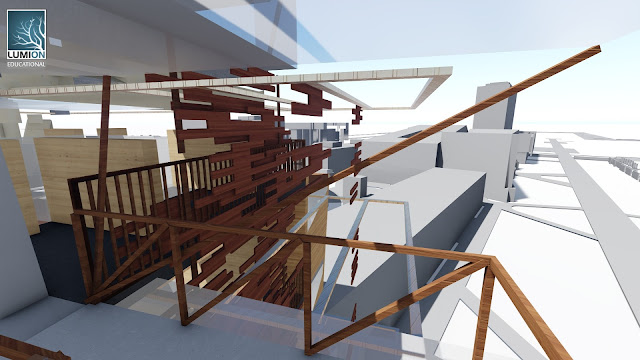
The central atrium and the common space around it is not enclosed by solid wall on the side facing the campus main walkway. the upper floors of this side is covered by a expandable timber screen layers. The expansion of the timber screen can refer to one of my mess-up theory by  Zaha Hadid about removing barriers, creating an intensity by condensing and opening things up.


The central atrium opening leads the sky view for the people below. It also provide nice natural lighting for each floor, for example, the office space on the top floor have no opening on two sides but the central atrium sky light compensates it.


The main part of the building (the central part) is constructed lightly with just timber handrails on the campus main walkway side, contrasting with the heavier blocks around.

Being open doesn't means to sacrifice privacy. The privacy is maintained by flexible moving elements such as the opening and combining of the south side timber screen and the grid moving walls around the center. So it refers to one of my mess-up theory by  Frank Lloyd Wright about the harmony between individual and the whole.


What are the conflicts included in this building? 


The design of shape is one of the conflict. The main envelop is rigid shapes with sharp corners. Some curved shapes appear from part of the third floor ceiling so as extend to the whole forth floor. Two kind of shape push on each other forms a interesting transition of atmosphere but keeping the same flexibility of space.


The gallery corridor to the square house is also a combination of open and semi open space. The roof walkway is fully exposed to the sky but provide public exhibition and view the works from the top window opening. The interior gallery links to the circulation to Squarehouse make the gallery space more vivid with the circulation rather than disturbing the peace of gallery.


The Rooftop common area can only be reached by the platform lift which make the space more unique as a significant element of the building.


The main stairs is left exposed, yet It doesn't cause inconvenience, on the other hand, It become a clear sign for circulation. The glass shading on top of the stairs keeps the timber balustrade out from rain.  The stairs also enhance the visual effect of the moving timber screen south facade.


Can the natural elements exist in part of the building? Yes, a mature tree which originally grows on the site is included in the high ground floor. It helps the building fit to the site better. Zaha Hadid also mentions to gather and bundle the energy inherent in a site. I think plants are important site member.


Reflection

Room for improvement : I would like to make more space for the office and research studio. One of the way I thought of is adding strongly connected platform like the Central Park building in Sydney. For now my east top floor facade is quite flat. This kind of extension can enrich the facade view. The extension can even overlap the above air with the low rising nearby Blockhouse. 

Also, If possible, I would like to make the building more 3D by reducing flat surface but keep the same image and function of space.


Peer Comments


Comments : "Interesting use of spaces."


SketchUp Upload (the colors are for better material applying in Lumion)

 3D Viewer


Download:

https://3dwarehouse.sketchup.com/model.html?id=b46334b7-e350-4e85-92cc-b1f830429426


The Lumion File (checked) (I don't know how to choose the files in the "Library" file, so I upload all of them to my drive)


https://drive.google.com/folderview?id=0B9bXh09bzF4yWk5ybjU2NEZxTUE&usp=sharing
0

Animation for EXP3 and Applying Textures


Video Focusing on Moving Elements


Full Video for the Spacial Arrangement


3 places for applying textures

Linear Movement (On the timber screen layers)


Scalar Movement (On the moving walls around the central atrium)


Plunge Movement (On the central platform lift)


0

Developed model in Lumion environment (screen shots)


The slant entrance of the lecture theatre with a V- stair to the second floor of the theatre.


The gallery space with a marble stone entrance. Connecting to the building on the side. The space between becomes a green house and a common space for circulation.


The gallery walkway


Outside the gallery


View from the exterior stair of the wood boarding expansion moving element.


One of the floor with the moving wall, view to the central atrium.


The choosing of dark grey concrete: most of this building's material is plain colors, like light brown for wood and warm grey for concrete, light orange for brickwork. I decided to add some more contrast in color and found dark grey concrete is very cool for making the variety of building 's mood.
0

The first draft, moving elements and the inspirations

In my section drawing, it includes quite many shapes. And my first production is a combination of weird shapes.

After that, I tried to simplify all those shapes which make them look more consistent. I worked out the building with many polygonal parts which serve different functions just like my section drawing.

After satisfied with the building envelope, I start think about how the interior can fit the function and the shape.

For environmental concern, I tried to add different kinds of shading that are installed on facades.

My two moving element are surrounding to the central atrium concept. A significant feature of this building design is the negative space at the middle of the building which is a atrium and surrounded circulation.

The first moving element is a movable facade with the separation of wood board. This can create different degree of lighting effect and also for a thermal control during hot and cool time. The wall consisted of wood boarding can extend for 4 layers by mechanical system. In summer, the facade can expand to enhance ventilation. In winter, The layers can be combined to be a whole wall which protect the people inside from cool breezing.

The second moving element is a flexible wall installation mainly around the central atrium in 2 floors.The block can extend ups and downs so as to be tables, sits for students, and also separate spaces.

The sides of the block can also be pulled out from different identical section which is flexible for different uses, for example, the one above you can be a rack for putting valuables. The one below you can be for sitting. The one fits to your hand level may be a table.

In addition, there will be an extension of gallery space along to the square house with a roof bridge.

The design is also considering the natural environment for conserving trees. Three main mature tree will be kept and integrate into the building plan.

Inspiration Architectures


The Bordeaux House by Rem Koolhaas, the inspiration of a central atrium with a lift.


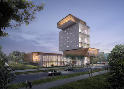
Forum building for the University of Chicago, by architects  
Diller Scofidio + RenfroInspiration of rigid forms stack together and the placement of openings.


and the New York High Line Project by the same architects. Inspiration for a garden on a bridge and putting public arts.


Centre Pompidou in Paris by Renzo Piano and Richard Rogers. Inspiration for Light weight construction and an exterior stairs.


Department store Le Bon Marché in Paris. Inspiration for stair design.


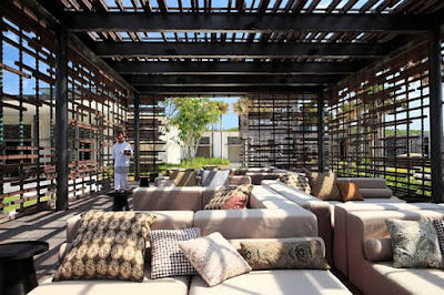
The Uluwatu Villas designed by Singaporean firm WOHA. Inspiration for timber screen with random pattern.


The Draft Model in Lumion


The Central Atrium


The Two Moving Elements

Moving facade


Moving walls

0

copyright © . all rights reserved. designed by Color and Code

grid layout coding by helpblogger.com