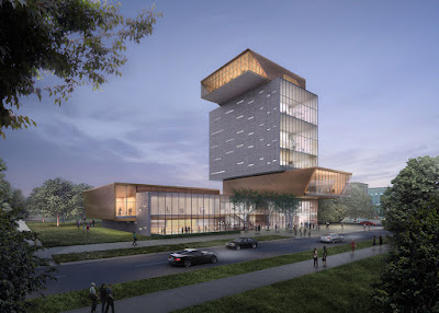
In my section drawing, it includes quite many shapes. And my first production is a combination of weird shapes.
After that, I tried to simplify all those shapes which make them look more consistent. I worked out the building with many polygonal parts which serve different functions just like my section drawing.
After satisfied with the building envelope, I start think about how the interior can fit the function and the shape.
For environmental concern, I tried to add different kinds of shading that are installed on facades.
My two moving element are surrounding to the central atrium concept. A significant feature of this building design is the negative space at the middle of the building which is a atrium and surrounded circulation.
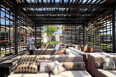
The first moving element is a movable facade with the separation of wood board. This can create different degree of lighting effect and also for a thermal control during hot and cool time. The wall consisted of wood boarding can extend for 4 layers by mechanical system. In summer, the facade can expand to enhance ventilation. In winter, The layers can be combined to be a whole wall which protect the people inside from cool breezing.
The second moving element is a flexible wall installation mainly around the central atrium in 2 floors.The block can extend ups and downs so as to be tables, sits for students, and also separate spaces.
The sides of the block can also be pulled out from different identical section which is flexible for different uses, for example, the one above you can be a rack for putting valuables. The one below you can be for sitting. The one fits to your hand level may be a table.
In addition, there will be an extension of gallery space along to the square house with a roof bridge.
The design is also considering the natural environment for conserving trees. Three main mature tree will be kept and integrate into the building plan.
Inspiration Architectures
The Bordeaux House by Rem Koolhaas, the inspiration of a central atrium with a lift.
Forum building for the University of Chicago, by architects
Diller Scofidio + Renfro. Inspiration of rigid forms stack together and the placement of openings.
and the New York High Line Project by the same architects. Inspiration for a garden on a bridge and putting public arts.
Centre Pompidou in Paris by Renzo Piano and Richard Rogers. Inspiration for Light weight construction and an exterior stairs.
Department store Le Bon Marché in Paris. Inspiration for stair design.


No comments:
Post a Comment